Worksheets are commonly used in various fields, such as education, accounting, and research. These documents provide a structured way to organize and present data, making it easier for users to understand and analyze information. However, different types of data require different formats to effectively communicate their meaning. In this article, we will discuss the common formats for worksheets, including tables, charts, and graphs.
Tables
Tables are the most basic format for organizing data in a worksheet. They consist of rows and columns that represent different categories and values, respectively. Tables can be used to present numerical data, such as sales figures, or non-numerical data, such as survey responses. They can also be used to compare data from different time periods, locations, or groups.
Tables can be formatted in various ways, depending on the purpose of the worksheet. For example, a simple table may only have a header row and a few columns, while a complex table may have multiple header rows, subheadings, and merged cells. Tables can also include formatting features, such as borders, shading, and font styles, to make them more visually appealing and easier to read.
Design Your Multiplication Worksheet
Charts
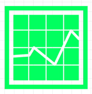
Charts are visual representations of data that help users understand the relationships between different variables. There are several types of charts, including bar charts, line charts, pie charts, and scatter plots. Each chart type is suitable for different types of data and analysis.
It is common to use bar charts for the purpose of comparing data among different categories. They consist of vertical or horizontal bars that represent the values of each category. Line charts, on the other hand, are used to show trends or changes in data over time. They consist of a line that connects data points for each time period.
Pie charts are used to show the proportion of each category within a larger group. They consist of a circle divided into sections, where each section represents a category and its size represents its proportion. Scatter plots are used for displaying the correlation between two variables. They consist of dots plotted on a two-dimensional graph, where the position of each dot represents the values of the two variables.
Charts can be customized with various formatting features, such as colors, labels, and legends, to make them more visually appealing and informative. However, it is important to avoid overcomplicating charts with too many features, which can make them confusing and difficult to interpret.
Graphs
Graphs are similar to charts in that they are visual representations of data. However, graphs are more complex than charts, as they can include multiple variables and relationships. Graphs are commonly used in scientific research, where they can help visualize and analyze data from experiments.
There are several types of graphs, including line graphs, bar graphs, scatter plots, and histograms. Each graph type is suitable for different types of data and analysis. Line graphs are employed to display trends or variations in data over a period, whereas bar graphs are utilized for comparing data among different categories. Scatter plots are used to show the relationship between two variables, while histograms are used to show the distribution of data across a range of values.
Graphs can be customized with various formatting features, such as colors, labels, and axes, to make them more visually appealing and informative. However, it is important to choose the appropriate graph type and format for the data, as using the wrong type or format can lead to inaccurate or misleading results.
Design Your Precision Teaching Worksheet

Summary
Worksheets are important tools for organizing and presenting data in a structured and understandable way. However, choosing the appropriate format for the data is essential to effectively communicate its meaning. Tables, charts, and graphs are the most common formats for worksheets, each with their own strengths and limitations. By understanding the characteristics of each format, users can choose the appropriate format for their data and analysis, and customize it with appropriate formatting features to enhance its visual appeal and readability.
When designing a worksheet, it is important to consider the purpose of the data and the intended audience. For example, a worksheet for a financial report may require a table or chart to present numerical data, while a worksheet for a scientific research paper may require a graph to visualize experimental data. Additionally, the formatting of the worksheet should be consistent and organized, with clear labeling and headings to guide the reader’s understanding.
To sum up, choosing the appropriate format for a worksheet is crucial for effectively communicating data and analysis. Tables, charts, and graphs are the most common formats used, each with their own strengths and limitations. The format chosen should depend on the type of data being presented and the purpose of the worksheet. By using appropriate formatting features and organizing the data in a clear and consistent manner, users can create worksheets that are visually appealing, easy to read, and informative.